
WHAT WE LEARNED AT THE BIGGEST BEER FESTIVAL IN THE WORLD.
In October, the Yeah Brother team attended the Great American Beer Festival. As one of the largest beer fests in the land, it was an opportunity to take the pulse on all things craft beer. From new launches to new packaging and new ways of doing business, we immersed ourselves in what was a truly an insightful experience.
TOP 5 TAKEAWAYS FROM THIS YEAR’S GABF:
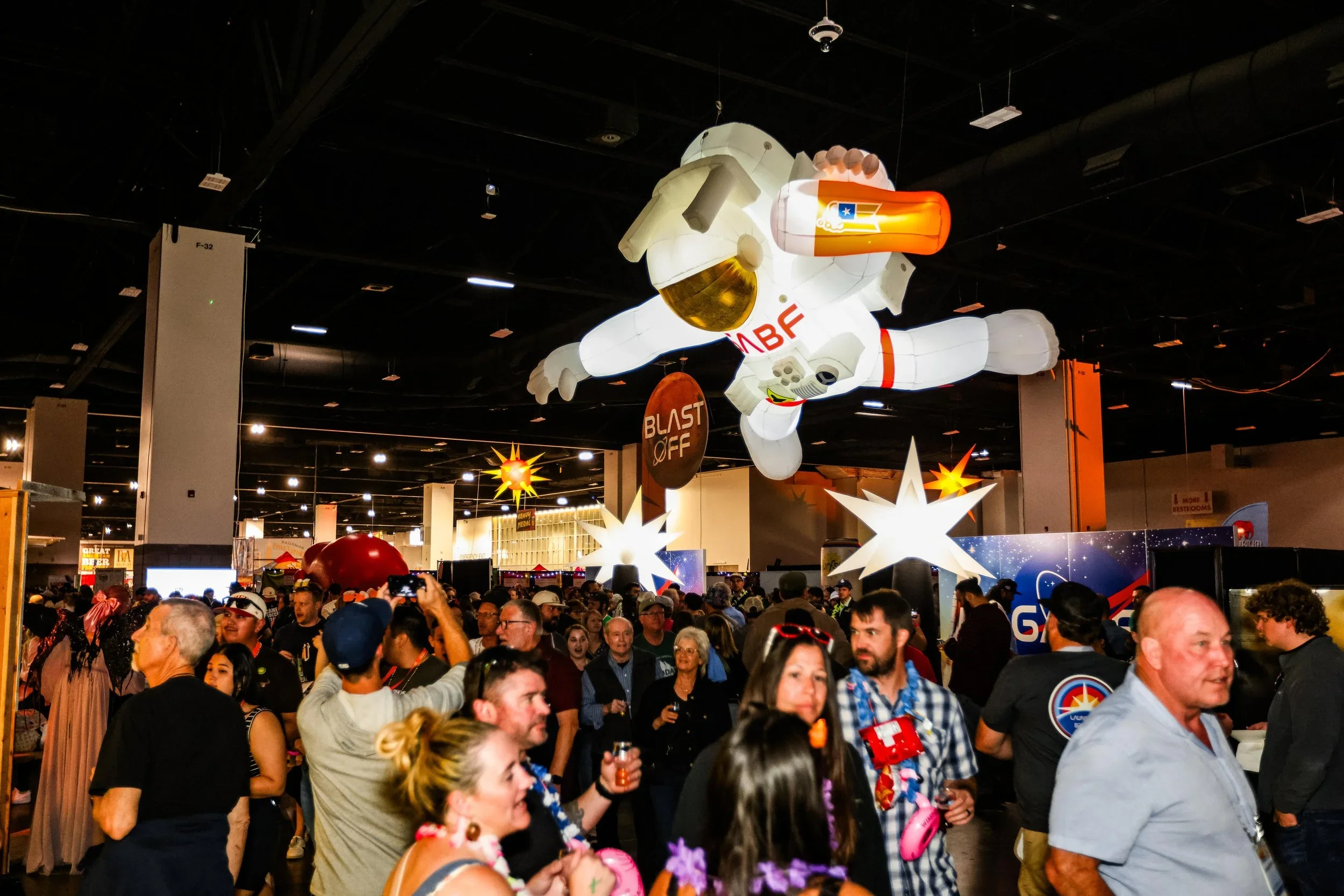
1. The "Experience Zone" Overhaul
Insight: Booth design has moved from transactional (rows of tables) to thematic immersion.
At GABF 2025, the festival floor was reorganized into specific "Experience Areas" (e.g., Prost, Chill, Blast Off, Fright). Brands that succeeded didn't just bring a backdrop; they designed "micro-worlds" that fit these themes.
Design Implication: Future trade show briefs should prioritize environmental storytelling over logo placement. We are seeing a move toward "Third Place" design principles, where booths are designed as hangouts with lounge seating and mood lighting, rather than just service counters.
Key Trend: Thematic Zoning. Aligning brand visuals with specific emotional states (e.g., "Chill" zones featuring soft textures and calming palettes vs. "Blast Off" zones utilizing high-energy, neon-heavy creative).
2. The "Sober-Curious" Visual Identity
Insight: Non-Alcoholic (NA) branding has shed its "substitute" stigma and entered its "lifestyle" era.
With dedicated "Non-Alcohol Pouring Stations" and major players like Athletic Brewing commanding prime real estate, NA beer design is no longer apologetic. It is premium, bold, and distinct.
Observation: NA packaging is using visual cues of activity and wellness (activewear aesthetics, matte finishes, clean typography) rather than mimicking traditional beer tropes.
Trend: Hyper-Legibility. A design shift toward making the "0.0%" or "Non-Alc" distinct but integrated elegantly into the logo lockup, treating it as a feature, not a disclaimer.
3. The "Digital-Tactile" Hybrid Package
Insight: Packaging is becoming a bridge between physical touch and digital content.
2025 saw a surge in labels that demand to be touched and scanned. Brands are moving beyond basic QR codes to integrated Smart Labels and Augmented Reality (AR) triggers that launch brand stories or playlists.
Texture: Use of tactile varnishes (grit, soft-touch, raised spot UV) to create a sensory grip—literally "sticky" branding.
Tech: "Invisible" tech integration where the artwork itself (not just a black-and-white square) triggers digital experiences.
Takeaway: We need to advise clients to budget for "connected packaging." The physical can is now just the portal to the digital brand world.
4. Neo-Nostalgia & "Kidult" Playfulness
Insight: In a stressful economic climate, design is pivoting toward comfort, humor, and "kidult" (kid-adult) aesthetics.
There was a noticeable move away from the stoic, heritage-driven "hipster" branding of the 2010s toward Maximalism and Play.
Mascots: A return of character-driven branding. Anthropomorphic animals, retro-cartoon styles, and doodle-art aesthetics were prominent (e.g., "Smoothie Beers" and Fruited Sours using vibrant, candy-shop color palettes).
Palette: Retro-Futurism. 1980s neon combined with Y2K liquid chrome effects.
Design Shift: Less "craftsmanship" signaling (hops, barley stalks) and more "vibes" signaling (abstract shapes, trippy illustrations).
5. Radical Transparency & "Clean" Labeling
Insight: Ingredient provenance is moving from the back of the can to the front of the design hierarchy.
As consumers become more health-conscious, designs that highlight what isn't in the beer (additives, GMOs) or exactly where it came from are winning.
Observation: "Hyper-local" isn't just a buzzword; it's a design system. Labels are featuring maps, farmer profiles, and specific harvest dates as central design elements.
Sustainability: Eco-Badge fatigue is setting in. The best designs are integrating sustainability into the materiality—using raw, uncoated papers or obvious "recycled" textures to visually signal eco-friendliness without needing a "Save the Earth" sticker.